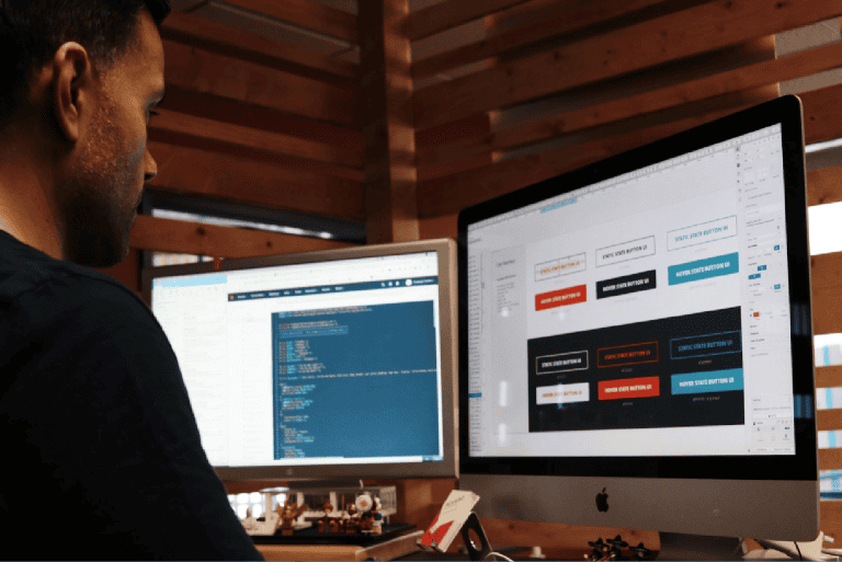
What makes an excellent B2B website? From design, exceptional content to outstanding user experience, many factors come to play when designing a B2B website that converts. For many B2B businesses, this is indeed one of the most critical sales tools; essentially, a good website is a digital storefront that allows you to engage and woo your prospects.
This is why knowing how to design an effective website is paramount for any B2B business. In this article, we will be sharing a practical and useful guide when it comes to best practices for B2B website design, as well as some inspiring examples of great B2B websites that will help you elevate your web design game.
Let’s look at your website
Our free video audit will take a look at your website and the UX-design of your website. We will send you a short video with an analysis from one of our talented team-members.
B2B website design: 5 best practices to get inspired
In a nutshell, a B2B website is a website that is specifically designed to showcase products or services that target other businesses, instead of direct retail customers. Typically, the B2B sales cycle is extended and complex. Hence, the majority of B2B web visitors have a longer customer journey, which often requires approval from multiple stakeholders as well as exhaustive research.
Thus, a good B2B website needs to steer clear from generalised, hard-selling marketing techniques. Instead, the website needs to be designed purposely to establish trust, credibility, and ultimately to persuade people to engage with your brand. Below are five B2B web design practices to follow for your business’ success:
1. Know your audience
Knowing your audience is the cornerstone of your web design efforts. Make sure to create user or buyer personas, and get to know your potential web visitors. Who are they? What problems are they trying to solve? To create a site that engages your web visitors, you need to understand their mindset and intent.
If you already have a website and you are in the process of designing a new one, make sure to review your current website analytics for the various segments of your web visitors, and implement heat maps and visitor recordings. This will help you identify your visitor behaviour, and understand which sections work and those who need improvement.
Get inspired: MailChimp

MailChimp does a great job of designing a website that speaks to its target audience. Providing a newsletter platform service for businesses, the company’s homepage directly speaks to potential customers looking to get their great marketing ideas across and offer them a solution. With easy-to-navigate and visually appealing menus, they make it easier for their audience to understand their offers, and how they can help achieve their client’s email marketing goals.
2. Define your value propositions
What are you offering, and what do you do best? A great B2B website builds a connection with their visitors the moment they arrive and builds trust as they explore. State your value proposition concisely and appealingly; explain what your company does and how you can solve their problems as clearly as possible.
Short, concise text does this best; however, you can also convey that value proposition through imagery, functionality, and the overall style of your website. Remember, this is the first thing that your web visitor sees when they land on your web pages , so it’s crucial it leaves a strong impression.
Get inspired: Stripe

Stripe makes its value proposition clear on the spot. It offers a solution for businesses looking for an online payment processing platform, and it frames itself as a successful and trusted brand, used by both established companies and burgeoning startups. Visitors of their website can quickly peruse through their features, and they make it easy for their potential customers to get in touch with their team for any product inquiry.
3. Implement lead acquisition and lead capture mechanism
Make your website the forefront in generating and nurturing leads by ensuring your forms and call-to-action (CTA) buttons are highly appealing and perfectly positioned. Think of your buyers’ journey and ensure everything is streamlined and uncluttered.
Make sure to use CTA copy that attracts, and position the buttons in places that grab attention. Remember to keep forms short to increase conversions, and design any sign-up process to feel seamless.
Get inspired: Asana

When the solution offered already speaks for itself, who can resist a free trial? Asana, a SaaS designed to improve team collaboration and work management, utilised a ‘Try for free’ CTA button to appeal to their potential customers. As web visitors explore their website, this CTA can be found after every feature description section, inviting them to sign up and start their buyers’ journey.
4. Create quality content
Offering web visitors access to high quality, thought-leadership content will elevate your brand and earn your customers’ trust. When designing a B2B website, allocate sections for blog articles, industry insights, webinars, or other quality content that will showcase your company’s expertise and industry leadership.
Furthermore, you could also opt to provide gated, premium content that your web visitors can access after they fill out a form. This could help you generate and nurture leads, and eventually guide your prospects closer to a buying decision.
Get inspired: Invision

Invision app is a prototyping tool that allows designers to create interactive mockups for their designs. The company’s website is an excellent example of how quality content can only lift the brand and drives conversions. Besides doing profiles on designers and design culture, Invision publishes blog posts, efficiency tricks and hacks, industry podcasts and many other pieces of educational content that position them as thought leaders in their field.
5. Tell your brand stories
Visual impression matters. Instead of directing users through complex navigations and heavy-loaded text streams, make sure to use captivating images and videos to tell your stories.
You can incorporate video or image in the “hero image” section of the home page design or in your website’s About section to tell your web visitors “Who you are” as a company. Remember to design everything with a purpose, and ensure that these images and videos are aligned with your brand voice.
Get inspired: Ruby


Ruby, a virtual receptionist and live chat company, makes their explainer video front and centre on their website. When a web visitor clicks on their “Watch Our Video” CTA, a full-screen video appears, and it gives the prospect an upbeat, fun-to-watch video about what the company does, and how their virtual receptionists work. It’s exciting, immediately engaging, and it inspires the prospects to learn more about the company.
Following these five best practices in B2B web design will play a substantial role in ensuring that you have a high performing website at your disposal. If you need help in designing a B2B website that really converts, don’t hesitate to let us know. Mowgli is here to help.


