What did we do?
- User Experience Audit
- E-Commerce Redesign
- User Interface Development
- WooCommerce Set Up
- Amazon Advertising
- Facebook and Google Ads With A/B testing
- Customer Service Set Up
Who are Fratelli Desideri?
Fratelli Desideri is an Italian company selling luxury meal kits that allow you to prepare Michelin star level dishes at home with fresh ingredients and unique recipes. It’s an innovative concept: while most e-commerce websites selling meal kits target their products at people looking for an efficient way to get their nutrition, Fratelli Desideri is all about discovering new flavors, learning how to cook and surprise your guests without spending hours behind the stove.
Fratelli Desideri got in touch with us to address a number of issues they had encountered with their e-commerce and develop solutions to increase their conversion rate in the long term. As happens with many young companies, their website had been set up quickly and many important details regarding the customer experience had been overlooked. Additionally, they were relying in part on distribution channels that didn’t allow for full control of their branding. In order to have a complete picture of what could be improved, we started with a complete audit of the website and user experience. This was the foundation of our growth strategy, which we’ll describe in detail in this case study.
Let’s look at your website
Our free video audit will take a look at your website and the UX-design of your website. We will send you a short video with an analysis from one of our talented team-members.
Our workflow
When starting a project focused on improving both the design and the conversion rate optimization (CRO) of an e-commerce website, it’s essential to develop a workflow that allows you to have a clear vision of your priorities. CRO can take up different shapes and forms and without a specific plan, it’s easy to get lost with experimenting and testing.
In order to work efficiently and provide our clients with the best possible results, we’ve developed a workflow that has proved effective with Fratelli Desideri and with past clients as well. We begin with a UX audit that highlights what the current issues are and the solutions we recommend implementing. This isn’t just for us to construct a strategy, it can also help the client see details that have been overlooked and gain a full picture of what their e-commerce’s potential is.
Following the audit, we label each task based on priority. We mark each task as “urgent,” “normal,” or “not urgent” and start working accordingly. These labels refer to operations that are essential for the smooth running of the business and should be implemented immediately, optimization techniques that require some testing and suggestions for improvement that may come at a later stage.
After changes are applied we compare the original statistics with the new analytics to measure the results and check whether some tweaking is needed to improve performance further.

The User Experience Audit
Most of the projects we work on start with an audit of the existing assets. This is the essential first step to have a clear vision of the different range of actions that will need to be taken to improve an e-commerce site. What was evident from the start in the case of Fratelli Desideri was the low conversion rate. How could this be optimized?
We focused on three categories of potential issues in their e-commerce:
- Technical: technical problems that are affecting the efficiency of the site and might affect directly or indirectly the user experience;
- Messaging: these issues are related to the messaging and language you use on the site, both for explaining the products (awareness) and guide the user through the buying process (acquisition-sell);
- UI: these problems are regarding the visual presentation of the website, especially focusing on the buying process to help create a path of low resistance for the customer to follow.
Our idea initially was to look at the users’ behavior to better understand what obstacles visitors encounter when they reached Fratelli Desideri’s website, however, we quickly found out that the statistical tools were not set up correctly. As we explained in our CRO for lead generation article, this is a common issue with e-commerce websites: there was a redundancy in the plugins installed for data tracking, which made the information in Google Analytics useless for marketing purposes.
What we could see was that Fratelli Desideri’s website was slow and relied too much on the design of a WordPress template to provide a flawless user experience. Additionally, there were some security issues: the website had no maintenance program set up, no spam filter and it was vulnerable to attacks.
Next to these issues, we found that the communication strategy employed by Fratelli Desideri and the structure of the existing website could be confusing for a first-time visitor, stopping them from proceeding to the checkout page and completing the purchase. The decision was made to redesign the website from scratch to fix the urgent matters and improve the design for a better user experience.
Redesigning the website
When you want to redesign an existing website from scratch, the typical method is to set up a staging site that you can work on without interrupting the visitors’ experience. With e-commerce, however, it isn’t always possible to just switch between different versions of a website, therefore we had to work on specific areas or pages while the shop was running.
Fratelli Desideri’s website was based on a basic WordPress template, which wasn’t optimized for conversions. As it often happens, it had been set up quickly by the client without much consideration of the user’s experience. Additionally, the product couldn’t reach its full potential in terms of sales despite being presented well because of the way the website is designed.
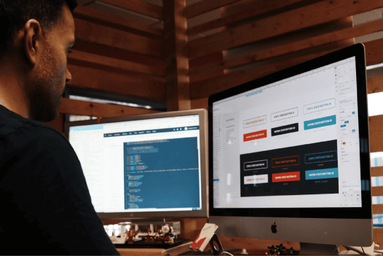
We started working on the new design using Elementor, building each page from scratch to function on any screen.
Our goal was to make the buyer’s journey more straightforward. We reduced the number of calls to action (CTAs), made the home page more compact and easy to navigate, and restructured the pages for simpler navigation.
User Experience
Speed was one of the main concerns in terms of UX: the home page took a whopping 27 seconds to load and from our experience, we know that anything above 10 seconds will mean customers bouncing back to where they came from. The video in the hero section was the main element slowing down the landing page, but high-resolution images and long pages also didn’t help. By addressing these issues in the new design we were able to reduce the loading speed of the home page from 27 to just 4 seconds.

Product, cart, and checkout pages
We noticed similar problems in the product and checkout pages. Conflicting CTAs, large headers, and too many distracting elements that were pushing the attention of the reader away from completing the purchase. Adding the product to the cart and checking out are the most important steps in the buyer’s journey. Fratelli Desideri had added different buttons of the same color on these key pages and didn’t provide a clear hierarchy of the steps the customer had to take in order to complete the transaction. This created a confusing environment that impacted the conversion rate negatively; we could see this from the way the traffic significantly dropped as the users proceeded in the funnel. We simplified each one of these pages, made them more mobile-friendly, and removed potential distractions that could take away, rather than add, from the user experience.

Organization of the content
An important aspect of UX was how the products were labeled and categorized. It wasn’t as simple as it should be to switch between products and make a selection based on flavor, size, or allergies. We added the possibility to choose gluten-free meals or family boxes in just one click.
Communication
It wasn’t just the design that stopped many visitors from becoming customers. The messaging also needed to improve. A clear path to follow was absent: the visitors found themselves in front of multiple buttons with different microcopy that sent them in different directions. There was no hierarchy between primary and secondary CTAs and some of the text seemed to suggest that Fratelli Desideri was a food delivery service, rather than a company selling ready-to-make meals.
On top of the unclear text, we noticed images that were not communicating well what the product was all about. While there was a clear visual attempt to provide the visitors with how much of an amazing experience eating the dish can be, this was not followed by pictures of actual products. Fratelli Desideri was showing attractive dishes steaming from the plate, but it didn’t communicate from the start that it was a box of ingredients that were being sold.
Logistics
Fratelli Desideri works together with a partner company that assembles each box and mails it to the customers. This means that the e-commerce site needs to be connected to a management system that allows for every piece of information to travel without obstacles between the free parts.
After connecting the management system to the newly designed website, we noticed that Fratelli Desideri did not have a tool to check where every email was arriving at its destination. There can be dozens of reasons why an email gets stuck in a server, but without a software that notifies you, it becomes impossible to know whether the message has been sent.
We took the opportunity to optimize the communication processes between the partner company in charge of the logistics, Fratelli Desideri, and the final consumer, allowing our client to focus on the product rather than having to double-check every time an order is processed.
Digital Marketing
Fratelli Desideri had one main issue when it came to selling: it was too innovative. Many people didn’t even know a product of this kind existed, therefore they were not searching for it. While food delivery services have grown massively in recent years, the idea of an expensive, exclusive meal kit prepared by a Michelin-starred chef hadn’t yet been developed.
Initially, the client asked us to promote their products via Amazon. Starting from Amazon has many advantages – you don’t need a landing page and you can start selling right away with tools that are developed to perform well -, however, for Fratelli Desideri’s meal kits this wasn’t the optimal solution. Amazon is still slow on food products and even by targeting users interested in cooking utensils, it can be difficult to reach the right audience. Plus, it’s not cheap.
We quickly turned to Google and Facebook, which proved much more effective. We began testing with display ads, providing users with different copy and images. After targeting people who wanted to impress their guests, users that wanted to try a Michelin star experience at home, and those who wanted to reproduce a famous chef’s creation, we began seeing steady growth.
Out of the three channels we used for promotion, Facebook turned out to be the most powerful. Lead acquisition costs on Facebook are still relatively low compared to Google and Amazon, and after the first group of users started engaging with our ads it became easier to retarget them and convert them into customers.
Out of all the different ads we tested, videos performed best. We also noticed a positive side effect to our Facebook advertising campaigns: once people started buying the meal-kits via Facebook, orders began to grow on Amazon as well. Different platforms “speak” to each other – users may notice a product on social media, but then prefer to order it via a secondary channel they trust more.
Let’s look at your website
Our free video audit will take a look at your website and the UX-design of your website. We will send you a short video with an analysis from one of our talented team-members.
Customer Service
As soon as the new website was up and running we noticed an increase in the sales and, shortly later, better positioning on search engines. The number of orders grew dramatically as we were getting closer to Christmas. More orders, however, also meant more questions from customers, requests for assistance, and the occasional complaint. It became important to implement a customer service that was present and ready to answer incoming questions.
We installed a chat on the website through which a user could communicate directly with Fratelli Desideri, set up a more informative email automation to anticipate questions regarding shipping times and delivery, and set up a notification system that would allow the client to never miss a customer’s inquiry.
The Christmas success gave us another idea that became a permanent feature of Fratelli Desideri’s e-commerce. We gave the customer the option to buy the box as a gift. After noticing that many of the orders were sent to a different address than the one we would send the invoice to, we decided to offer the possibility to add a personalized card inside each box. This makes for a better user experience and allows visitors to purchase Fratelli Desideri’s meal kits as a present for any occasion.
Another great way to assist the customer with their cooking was to add a QR code to each package that links to a video showing the recipe. Fratelli Desideri sells about a dozen products all around Europe, with videos available in Italian, English, French, and German. To allow international customers to have the best user experience, we built a multilanguage site that allows for all the information in each language to be easily found in one place.
Results
Before getting into the numbers, we must say that simplifying the processes was first and foremost a way for Fratelli Desideri to save many hours spent on solving technical issues and focus on what they know best: product development. We visited their headquarters in Cuneo and trained the staff to build new pages, add categories and filters, create new products, and manage the basic functions of WordPress. This meant being self-sufficient and able to make small changes without having to wait for an external agency.

In terms of conversions, the increase was almost immediate: from a 1% conversion rate that Fratelli Desideri had with their original e-commerce, now the website has a steady 2% conversion rate with 3% peaks during festive seasons.


